week-8 前端 Lab
接下来我们将实现一个组件画廊,展示 Vuetify 的一些组件。在 components/ 目录下创建 Gallery.vue 文件,代码如下:
这是一个分为三列的页面,使用 CSS 的 columns 属性实现布局。内容是各种的被定制过的 Vuetify 组件。
vue
<template>
  <v-container fluid>
    <div class="masonry">
      <!-- 卡片示例 -->
      <v-card class="masonry-item" elevation="4">
        <v-img src="https://picsum.photos/400/200?random=1" height="200px">
          <v-overlay :value="true">
            <v-btn color="white" @click="handleClick">点击查看</v-btn>
          </v-overlay>
        </v-img>
        <v-card-title>卡片标题</v-card-title>
        <v-card-text>
          这是一个示例卡片,展示了 Vuetify 的卡片组件。
        </v-card-text>
        <v-card-actions>
          <v-btn text color="primary">了解更多</v-btn>
          <v-spacer></v-spacer>
          <v-btn icon>
            <v-icon>mdi-heart</v-icon>
          </v-btn>
          <v-btn icon>
            <v-icon>mdi-share</v-icon>
          </v-btn>
        </v-card-actions>
      </v-card>

      <!-- 按钮示例 -->
      <v-sheet class="masonry-item pa-4" elevation="2">
        <v-btn color="primary" class="ma-2">主要按钮</v-btn>
        <v-btn color="secondary" class="ma-2">次要按钮</v-btn>
        <v-btn color="success" class="ma-2">成功按钮</v-btn>
        <v-btn color="error" class="ma-2">错误按钮</v-btn>
        <v-btn color="warning" class="ma-2">警告按钮</v-btn>
        <v-btn color="info" class="ma-2">信息按钮</v-btn>
      </v-sheet>

      <!-- 表单示例 -->
      <v-form class="masonry-item pa-4" elevation="2">
        <v-text-field label="姓名" required></v-text-field>
        <v-text-field label="电子邮件" type="email" required></v-text-field>
        <v-select
          label="选择一个选项"
          :items="['选项一', '选项二', '选项三']"
          required
        ></v-select>
        <v-checkbox label="同意条款" required></v-checkbox>
        <v-btn color="success" class="mt-4">提交</v-btn>
      </v-form>

      <!-- 警告示例 -->
      <v-alert type="success" class="masonry-item">这是一个成功警告。</v-alert>
      <v-alert type="error" class="masonry-item">这是一个错误警告。</v-alert>
      <v-alert type="warning" class="masonry-item">这是一个警告提示。</v-alert>
      <v-alert type="info" class="masonry-item">这是一个信息提示。</v-alert>

      <!-- 导航栏示例 -->
      <v-toolbar color="indigo" dark class="masonry-item">
        <v-toolbar-title>导航栏标题</v-toolbar-title>
        <v-spacer></v-spacer>
        <v-btn text>主页</v-btn>
        <v-btn text>关于</v-btn>
        <v-btn text>联系</v-btn>
      </v-toolbar>

      <!-- 对话框示例 -->
      <v-dialog v-model="dialog" max-width="500">
        <template v-slot:activator="{ on, attrs }">
          <v-btn color="primary" class="masonry-item" v-bind="attrs" v-on="on">打开对话框</v-btn>
        </template>
        <v-card>
          <v-card-title class="headline">对话框标题</v-card-title>
          <v-card-text>
            这是一个示例对话框,展示了 Vuetify 的对话框组件。
          </v-card-text>
          <v-card-actions>
            <v-spacer></v-spacer>
            <v-btn color="green darken-1" text @click="dialog = false">取消</v-btn>
            <v-btn color="green darken-1" text @click="dialog = false">确定</v-btn>
          </v-card-actions>
        </v-card>
      </v-dialog>

      <!-- 列表示例 -->
      <v-list class="masonry-item" dense>
        <v-list-item>
          <v-list-item-icon>
            <v-icon>mdi-home</v-icon>
          </v-list-item-icon>
          <v-list-item-content>
            <v-list-item-title>主页</v-list-item-title>
          </v-list-item-content>
        </v-list-item>
        <v-list-item>
          <v-list-item-icon>
            <v-icon>mdi-account</v-icon>
          </v-list-item-icon>
          <v-list-item-content>
            <v-list-item-title>用户</v-list-item-title>
          </v-list-item-content>
        </v-list-item>
        <v-list-item>
          <v-list-item-icon>
            <v-icon>mdi-settings</v-icon>
          </v-list-item-icon>
          <v-list-item-content>
            <v-list-item-title>设置</v-list-item-title>
          </v-list-item-content>
        </v-list-item>
      </v-list>

      <!-- 进度条示例 -->
      <v-progress-linear
        class="masonry-item"
        indeterminate
        color="blue"
      ></v-progress-linear>

      <!-- 卡片网格示例 -->
      <v-card class="masonry-item" elevation="3">
        <v-carousel cycle height="200px">
          <v-carousel-item
            v-for="i in 3"
            :key="i"
            :src="`https://picsum.photos/800/200?random=${i + 10}`"
          ></v-carousel-item>
        </v-carousel>
        <v-card-title>轮播卡片</v-card-title>
        <v-card-text>
          这是一个包含轮播组件的卡片示例。
        </v-card-text>
      </v-card>

      <!-- 标签页示例 -->
      <v-tabs class="masonry-item">
        <v-tab>标签一</v-tab>
        <v-tab>标签二</v-tab>
        <v-tab>标签三</v-tab>

        <v-tab-item>
          <v-card flat>
            <v-card-text>内容一</v-card-text>
          </v-card>
        </v-tab-item>
        <v-tab-item>
          <v-card flat>
            <v-card-text>内容二</v-card-text>
          </v-card>
        </v-tab-item>
        <v-tab-item>
          <v-card flat>
            <v-card-text>内容三</v-card-text>
          </v-card>
        </v-tab-item>
      </v-tabs>

      <!-- 数据表格示例 -->
      <v-data-table
        class="masonry-item"
        :headers="headers"
        :items="items"
        disable-pagination
        disable-sort
      >
        <template v-slot:top>
          <v-toolbar flat>
            <v-toolbar-title>数据表格</v-toolbar-title>
            <v-divider
              class="mx-4"
              inset
              vertical
            ></v-divider>
          </v-toolbar>
        </template>
      </v-data-table>

      <!-- 卡片组示例 -->
      <v-card-group class="masonry-item" column>
        <v-card
          v-for="n in 3"
          :key="n"
          class="mx-2"
          max-width="344"
        >
          <v-img
            src="https://picsum.photos/400/200?random=20"
            height="200px"
          ></v-img>
          <v-card-title>卡片组 {{ n }}</v-card-title>
          <v-card-text>
            这是卡片组中的一个卡片,展示了 Vuetify 的卡片组组件。
          </v-card-text>
          <v-card-actions>
            <v-btn text color="primary">操作</v-btn>
          </v-card-actions>
        </v-card>
      </v-card-group>

      <!-- 其他组件示例 -->
      <v-chip class="masonry-item" color="purple" text-color="white">标签</v-chip>
      <v-avatar class="masonry-item" size="64">
        <img src="https://picsum.photos/64/64?random=30" alt="Avatar">
      </v-avatar>
      <v-badge color="red" content="4" class="masonry-item">
        <v-icon large>mdi-bell</v-icon>
      </v-badge>
      <v-tooltip bottom>
        <template v-slot:activator="{ on, attrs }">
          <v-btn color="pink" v-bind="attrs" v-on="on">悬停我</v-btn>
        </template>
        <span>这是一个提示工具</span>
      </v-tooltip>
      <v-snackbar v-model="snackbar" timeout="3000">这是一个Snackbar提示!</v-snackbar>
      <v-btn color="orange" class="masonry-item" @click="snackbar = true">显示Snackbar</v-btn>
    </div>
  </v-container>
</template>

<script>
export default {
  name: "ComponentGallery",
  data() {
    return {
      dialog: false,
      snackbar: false,
      headers: [
        { text: '名称', value: 'name' },
        { text: '年龄', value: 'age' },
        { text: '职业', value: 'occupation' },
      ],
      items: [
        { name: '张三', age: 28, occupation: '工程师' },
        { name: '李四', age: 34, occupation: '设计师' },
        { name: '王五', age: 45, occupation: '经理' },
      ],
    };
  },
  methods: {
    handleClick() {
      alert('按钮被点击了!');
    },
  },
};
</script>

<style scoped>
.masonry {
  column-count: 3;
  column-gap: 1rem;
}

.masonry-item {
  break-inside: avoid;
  margin-bottom: 1rem;
}

@media (max-width: 1200px) {
  .masonry {
    column-count: 2;
  }
}

@media (max-width: 768px) {
  .masonry {
    column-count: 1;
  }
}
</style>让我们把这个跑起来,体验组件中的特效和功能。
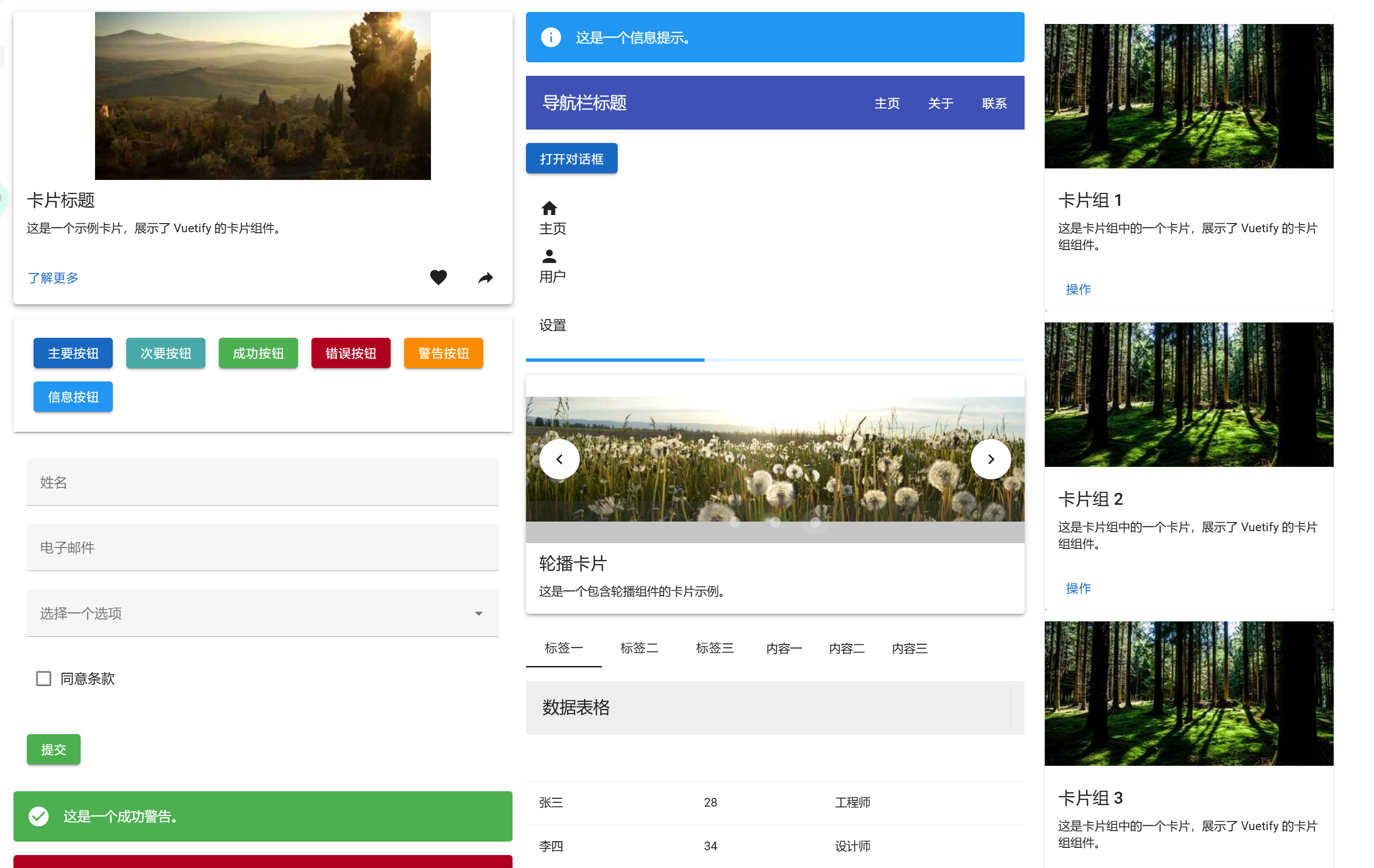
展示的 Vuetify 组件有
卡片 (v-card): 包含图片、标题、文本和操作按钮。
按钮 (v-btn): 展示不同颜色和样式的按钮。
表单组件 (v-form, v-text-field, v-select, v-checkbox): 基本的表单输入。
警告 (v-alert): 不同类型的警告消息。
导航栏 (v-toolbar): 顶部导航栏示例。
对话框 (v-dialog): 可激活的对话框示例。
列表 (v-list): 基本的列表项展示。
进度条 (v-progress-linear): 展示进度条动画。
轮播 (v-carousel): 图片轮播组件。
标签页 (v-tabs): 可切换的标签页内容。
数据表格 (v-data-table): 简单的数据表格展示。
卡片组 (v-card-group): 多个卡片的组合展示。
其他组件: v-chip, v-avatar, v-badge, v-tooltip, v-snackbar 等。